

HTML / CSS
This article will help you to revise all the basic concepts of HTML and CSS. In the end, there will be some resources that will help you to learn more about HTML/CSS.
What is HTML?
- HTML stands for HyperText Markup Language.
- HTML is used for creating web pages, it describes the structure of a web page.
- HTML consists of a series of elements that tell the browser how to display the content.
A simple HTML Document
<!DOCTYPE html>
<html>
<head>
<title>Page Title</title>
</head>
<body>

<h1>My First Heading</h1>
<p>My first paragraph.</p>

</body>
</html>
Example Explanation
- The <!DOCTYPE html> declaration defines that this document is an HTML5 document.
- The
<html>element is the root element of an HTML page. - The
<head>element contains meta information about the HTML page. - The
<title>element specifies a title for the HTML page (which is shown in the browser's title bar or in the page's tab). - The
<body>element defines the document's body and is a container for all the visible contents, such as headings, paragraphs, images, hyperlinks, tables, lists, etc. - The
<h1>element defines a large heading. - The
<p>element defines a paragraph.
What is an HTML element?
An HTML element is defined by a start tag, some content, and an end tag:
<tagname> Content </tagname>

eg:
<h1> Welcome!! </h1>
<p> my first paragraph </p>
You can use any text editor or any IDE to write HTML codes. HTML files
are stored using the .html extension and can be open using any web browser.
structure of HTML
<html>
    <head>
        <title> Page title </title>
    </head>
    <body>
        content
    </body>
</html>
above is the structure of an HTML code.
Head section <head>
- The
<head>element is a container for metadata (data about data) and is placed between the<html>tag and the<body>tag. - HTML metadata is data about the HTML document. Metadata is not displayed.
- Metadata typically define the document title, character set, styles, scripts, and other meta information.
<head> elements
<title>element defines a title in the browser toolbar. Important for search engine optimization.
<!DOCTYPE html>
<html>
<head>
  <title>This is Title</title>
</head>
<body>

The content of the document......

</body>
</html>
<style>element is used to define style information for a single HTML page it is for internal CSS.
<style>
  body {background-color: powderblue;}
  h1 {color: red;}
  p {color: blue;}
</style>
<link>element defines the relationship between the current document and an external resource. It is most often used to link the external CSS file.
<link rel="stylesheet" href="mystyle.css">
<meta>element is typically used to specify the character set, page description, keywords. The metadata will not be displayed on the web page.
<meta charset="UTF-8">
<meta name="description" content="Free Web tutorials">
<meta name="keywords" content="HTML, CSS, JavaScript">
<meta name="author" content="John Doe">
<script>element is used to define client-side JavaScripts.
<script>
function myFunction() {
  document.getElementById("demo").innerHTML = "Hello JavaScript!";
}
</script>
<base> element specifies the base URL and/or target for all relative urls on a page.
<head>
<base href="https://www.w3schools.com/" target="_blank">
</head>
Now we know the basic tags for the head element. we don't need to remember all these tags If you are using
IDE like visual studio it has a feature if you write ! then press enter. it will give you the boilerplate of the HTML code structure.
<body> elements
In the body we used different tags to write our content till now we have seen the <h1> and <p> tags.
similarly, there are more tags that we can use to create our content.
Basic Tags
<h1> to <h6> these are a group of heading tags used to create a heading in a web page.
<h1>Heading 1</h1>
<h2>Heading 2</h2>
<h3>Heading 3</h3>
<h4>Heading 4</h4>
<h5>Heading 5</h5>
<h6>Heading 6</h6>
<p> it defines the paragraph in a web page
<p> Hi!! Vivek Here. </p>
<!--..--> is used to write comments in HTML
<!-- this is paragraph tag -->
<p> paragraph tag </p>
<br> is used for a line break. everything you will write after the <br> tag will continue in the next line you don't need to close this tag.
Hello<br>World!!

output:

Hello
World!!
<hr> is used to create a horizontal lines in a webpage.
till now we have seen some basic tags. let's see the formatting tags.
Formatting Tags
<b> is used to define bold text.
I am <b> BOLD </b>
<strong> is used to define Important text, add more semantic meaning to the tag.
<strong> Important </strong>
<i> it formats text in the Italic form
I am <i> Italic </i>
<em> it represents stress emphasis on the text same as <i> tag.
I am <em> Emphasized word </em>
<u> it underlines the text.
<u> I am underlined phrase </u>
some more tags
<img> defines an image on a webpage.
<img src="path of image" alt="text till image loads">
<a> defines a hyperlink to connect to other pages
<a href="path of file or link to connect"></a>
<ol> it defines as an ordered list.
<ol>
    <li> one </li>
    <li> two </li>
    <li> three </li>
</ol>

output:
1. one
2. two
3. three
<ul> defines an unordered list.
<ol>
    <li> one </li>
    <li> two </li>
    <li> three </li>
</ol>

output:
* one
* two
* three
<li> defines list items as we have seen in the above Example.
HTML forms
<form> it is used to create a form on a webpage
<form method="post/get" action=""></form>
<input> defines input of different types in form.
<form method="post/get" action="">
    <input type="text" name="text" id= "text" placeholder="enter text">
</form>
<label> defines the label for input. taking the above example.
<form method="post/get" action="">
    <label for="text">this is label for input with id as text</label>
    <input type="text" name="text" id= "text" placeholder="enter text">
</form>
<select> it provides control to select multiple options, there are different <option> tag used inside select tag.
<form method="post/get" action="">
   <select id="cars" name="cars">
  <option value="volvo">Volvo</option>
  <option value="saab">Saab</option>
  <option value="fiat">Fiat</option>
  <option value="audi">Audi</option>
</select>
</form>
<button> defines a clickable button.
<button type="button" onclick="alert('Hello World!')">Click Me!</button>
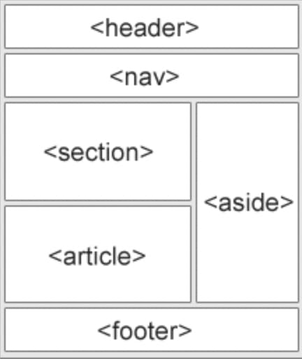
HTML semantic tags
A semantic element clearly describes its meaning to both the browser and the developer.
Examples of non-semantic elements: <div> and <span> - Tells nothing about its content.
Examples of semantic elements: <form>, <table>, and <article> - Clearly defines its content.
<div> defines a group of elements within the HTML document. It is a block-level element.
<div>one</div>
<div>two</div>
<div>three</div>
<span> defines an inline section within the document.
<span> hello </span>
<header> defines the header of the web page or a section. we can define nav links or navbar in the header section.
<header> This is Header <header>
<section> defines a section of a document.
<section>
    <h1>heading</h1>
    <p> content </p>
</section>

<section>
    <h1>heading</h1>
    <p>content</p>
</section>
<article> element specifies independent, self-contained content. An article should make sense on its own like blog posts, user comments, newspaper articles.
<article>
    <h2>Google Chrome</h2>
    <p>Google Chrome is a web browser developed by Google, released in 2008. Chrome is the world's most popular web browser today!</p>
</article>
<footer> defines a footer for a document page. It mainly contains authorship information, copyright information, back to top links, related documents.
<footer>
  <p>Author: Hege Refsnes</p>
  <p><a href="mailto:hege@example.com">hege@example.com</a></p>
</footer>
<nav> defines a set of navigation links.
<nav>
  <a href="/html/">HTML</a> |
  <a href="/css/">CSS</a> |
  <a href="/js/">JavaScript</a> |
  <a href="/jquery/">jQuery</a>
</nav>
<aside> defines some content aside from the content it is placed in like a sidebar. It should be directly or indirectly related to the surrounding content.
<aside>
    <h4>Epcot Center</h4>
    <p>Epcot is a theme park at Walt Disney World Resort featuring exciting attractions, international pavilions, award-winning fireworks and seasonal special events.</p>
</aside>
I think almost some of the basics regarding HTML elements and tags are covered there are many more you can explore more.
If you are reading this then you know how to structure a webpage. Now to make it look good we are going to use CSS.
CSS (Cascading Style Sheets)
CSS describes how HTML elements are to be displayed on the screen, paper, or in other media.
Before starting looking for the CSS example we should know what CSS selectors are?
Selector is used to "find" (or select) the HTML elements you want to style.
h1{
    color: red;
}
here looking above example h1 is selector colour is the property and red is value. This is how CSS is written.
Three types of selectors:
element selectorbasically select HTML elements based on elements tag name.
p{
    color: red;
}
id selectoruses the id attribute of an HTML element to select a specific element.
<p id = "one"> ONE </p>

#one{
    color: red;
}
class selectoruses the class attribute of an HTML element to add properties to those who all have the same class name.
<h1 class = "head"> heading 1 </h1>


.head{
    color: red;
}
There are 3 different ways we can write CSS and give visual meaning to HTML elements and tags.
Inline CSSis used to apply a unique style for a single element. we can use thestyleattribute to the relevant element.
<p style="color:red;">This is a paragraph.</p>

here the content between paragraphs will be in red.
Internal CSSis written in the same HTML file between head tag instyleattribute.
<html>
    <head>
        <title> first title </title>
        <style>
            h1{
                color:red;
            }
        </style>
    </head>
    <body>
        <h1> This is heading </h1>
    </body>
</html>
External CSSit is written in seperate.cssfile and linked to thehtmlfile using<link>tag.
style.css

h1{
    color: red;
}

index.html

<html>
    <head>
        <title> first title </title>
        <link rel="stylesheet" href="styles.css">
    </head>
    <body>
        <h1> This is heading </h1>
    </body>
</html>
CSS colors
In the above example, we were using colour property and we were providing the colour name as a value eg: red, green, blue.
there are four ways to write colour values.
RGBspecifies colour using red, green, blue values. It takes a number as a parameter, which defines the amount of red, green and blue colour and it returns the colour according to the amount mixed.
p{
    color: rgb(200,98,70);
}
NAMEusing a specific colour name can give you your desired colour.
p{
    color: violet;
}
Hexcodeis up to 6 figure numbers preceding with#.
p{
    color: #ffffff;
}
HSLis known as hue, saturation, lightness.
p{
    color: hsl(8,90%,10%)
}
there are 2 more RGBA and HSLA where A stands for alpha.
Background
Lets, see some of the background properties we can use to style the background.
body{
    background-color: red;
    background-image: url(image.png);
    background-repeat: no-repeat;
    background-size: contain;
    background-position: center;
    background-attachment: scroll;
}
above are some commonly used properties there is nothing to explain in plain English.
but we can use all this in a single line
body{
    background: red url(image.png) no-repeat contain;
}

it is known as shorthand property which helps to get the same result as the above example but with less code.
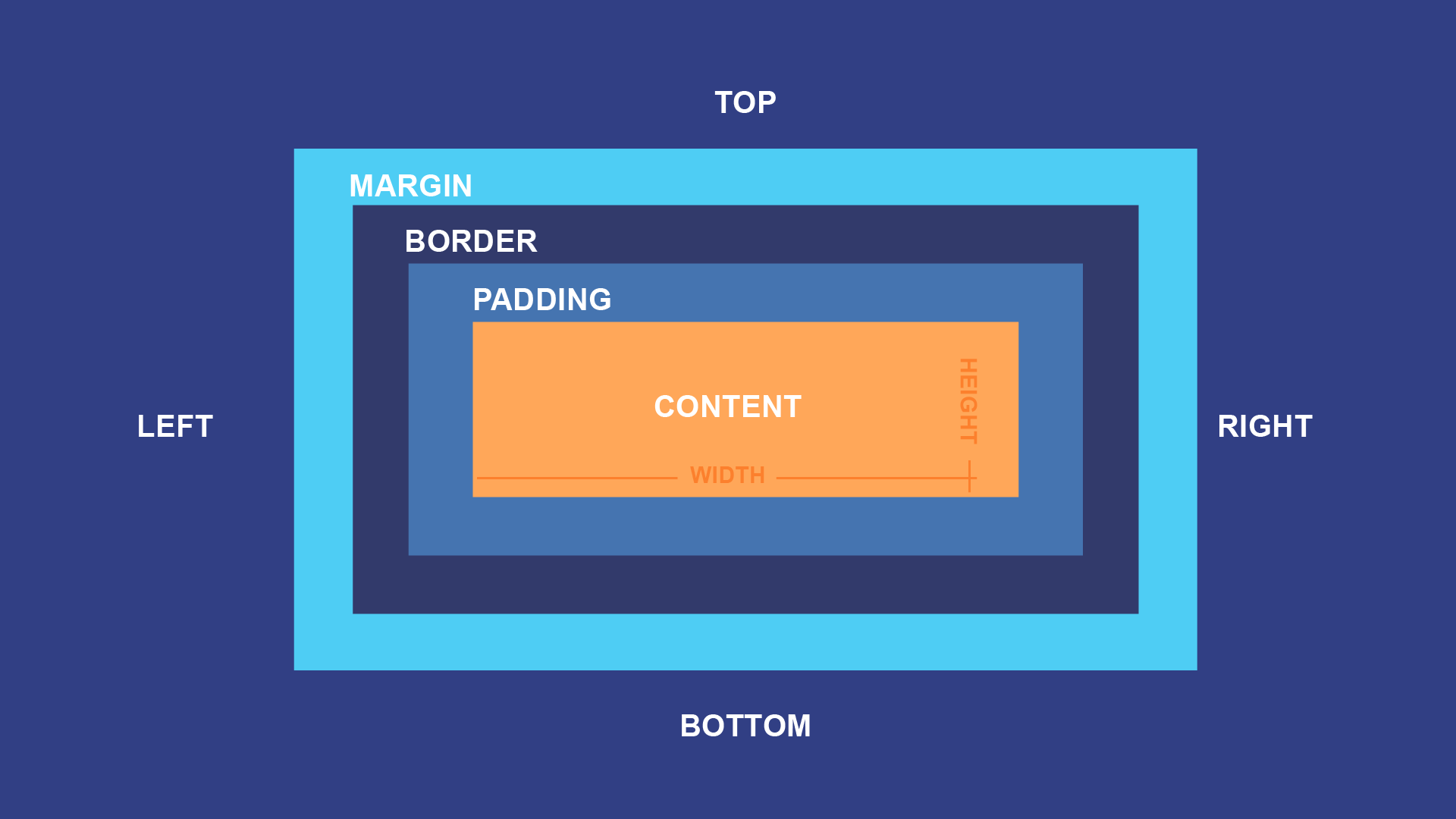
CSS BOX-MODEL
In CSS, the term 'box model is used when talking about design and layout.
The CSS box model is essentially a box that wraps around every HTML element. It consists of: margins, borders, padding, and the actual content. The image below illustrates the box model:
contentis the content of the box, where text and images appear.paddingclears an area around the content. The padding is transparent.Borderis a border that goes around the padding and content.marginclears an area outside the border. The margin is transparent.
div{
    width: 300px;
    border:15px solid green;
    padding: 50px;
    margin: 20px;
}
setting width and height
div{
    height: 70px;
    width: 70px;
}

total height = height + padding + margin + border
setting margin and padding
div{
    margin: 3px;
    padding: 10px;
}

{top right bottom left} properties allocate clockwise.

div{
    margin: 10px 20px 10px 20px;
}
setting borders
div{
    border-width: 2px;
    border-style: solid;
    border-color: black;

    //you can write below as oneliner.
    border: 2px solid black;

    border-radius: 10px;
}
fonts and display properties
The display property is used to determine whether an element is treated as a block/inline element and the layout used for its children (flexbox/grid).
div{
    display:inline;
    display: block;
    display: inline-block;
    display: none;
    vissibility: hidden;
}
inlinetakes out the space required by the element. NO line breaks before and after. Setting width and height not allowed neither margin and padding(top/bottom)blocktakes full space available in width and height and leaves a newline before and after.inline-blocksimilar to inline but setting height, width, margin and padding is allowed and elements can sit next to each other.nonethe element is removed from the document flow. its space is not blocked.hiddenthe element is hidden but its space is reserved.
inline elements
There are different HTML elements that are declared as inline by default some of them are : <a>, <br>, <span>, <label>, <input>, <img>.
block elements
There are different HTML elements that are declared as block by default some of them are: <div>, header, nav,.
div{
    text-align:center;
}

p{
    text-decoration: underline;
    text-transform: uppercase;
}
text-aligntells where to align the content inside the box.text-decorationhelps to decorate the particular text.text-transformwithout manually writing all the words uppercase you can use this property to transform it to uppercase or lowercase.
FONTS
font plays a very important role in the look and feel of a website.
p{
    font-family: "Times new Roman", monospace;
    font-size: 20px;
    font-style: oblique;
    font-weight: bolder;
}
font-familyis used to select a particular font style.font-sizeis used to adjust the size of the fonts.font-styleused to make font bold, italic.font-weightto make it look Emphasized we can give number input or text like light, bold, bolder.
size, position and list
There are more units for describing size other than 'px' there are rem, em, vw, vh, percentages etc.
Why pixels are not effective?
pixels(px) are relative to the viewing device. for a device with size 1920x1080, 1px is 1 unit out of 1080/1920.
relative lengths these units are relative to the other length property following are some of the most commonly used
relative lengths.
emunit relative to the parent font size.remunit relative to the root font size.vwunit relative to 1% viewport width.vhunit relative to 1% viewport height.%unit relative to parent element.
min/max -height/width property
CSS has a min-height, max-height, min-width and max-width property. If the content is smaller than the minimum height will be applied.
position property
used to manipulate the location of an element following is the possible values.
div {
    position: relative;
    position: absolute;
    position: static;
    position: sticky;
    position: fixed;
}
relativethe top/bottom/left/right/z-index will work.staticthe default position top/bottom/left/right/z-index has no effect.absolutethe element is removed from the flow is relatively positioned to its first non-static ancestor. top/bottom etc works.fixedjust like absolute except the element is positioned relative to the browser window.stickythe element is positioned based on users scroll position.
list-style property
The list-style property is shorthand for type, position and image.
url{
    list-style: square inside url('image.jpg')
}
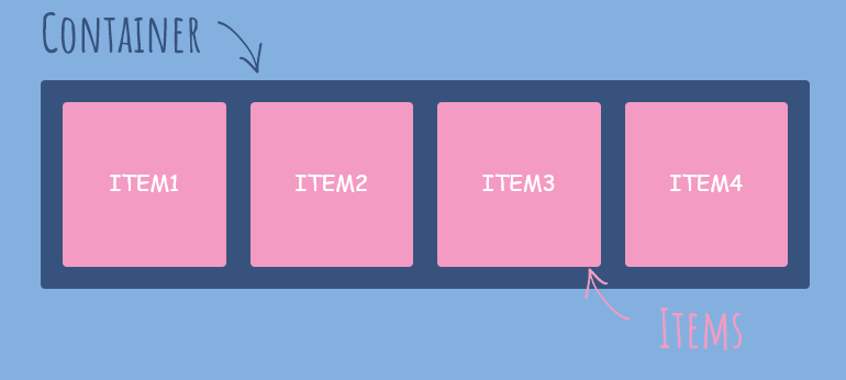
flexbox
It helps to provide a better way to layout align and distribute space among items in a container
.container{
    display: flex;
    flex-direction: row;
}
displayas we discussed earlier display property we can use flex to initialize the particular element act as flexbox.flex-directionshows the way the block elements will arrange, row, row-reverse, column, column-reverse.
flex-box parent property
The element which is displayed as flex is known as flex-container or parent flex container.
There are some properties associated with flex-container which will help to align the element inside that container.
flex-wrapcan be a wrap, no-wrap, wrap-reverse. we can wrap the items with the help of this property. It is helpful when we used different resolutions.justify-contentdefines alignment along the main axis. it can be centre, flex-start, baseline, flex-end.align-contentdefines alignment along cross-axis.align-contextaligns a flex container's lines when there are extra spaces in the cross axis.
flex properties for children
The element's inside the flexbox is known as flex items. there are different flex-items properties that can be helpful to align themselves irrespective to the parent properties.
ordercontrols the order in which the items appear in flex-direction.align-selfallows default alignment to be overridden for the individual flex items.flex-growdefines the ability for a flex item to grow.flex-shrinkdefines the ability for a flex item to shrink.
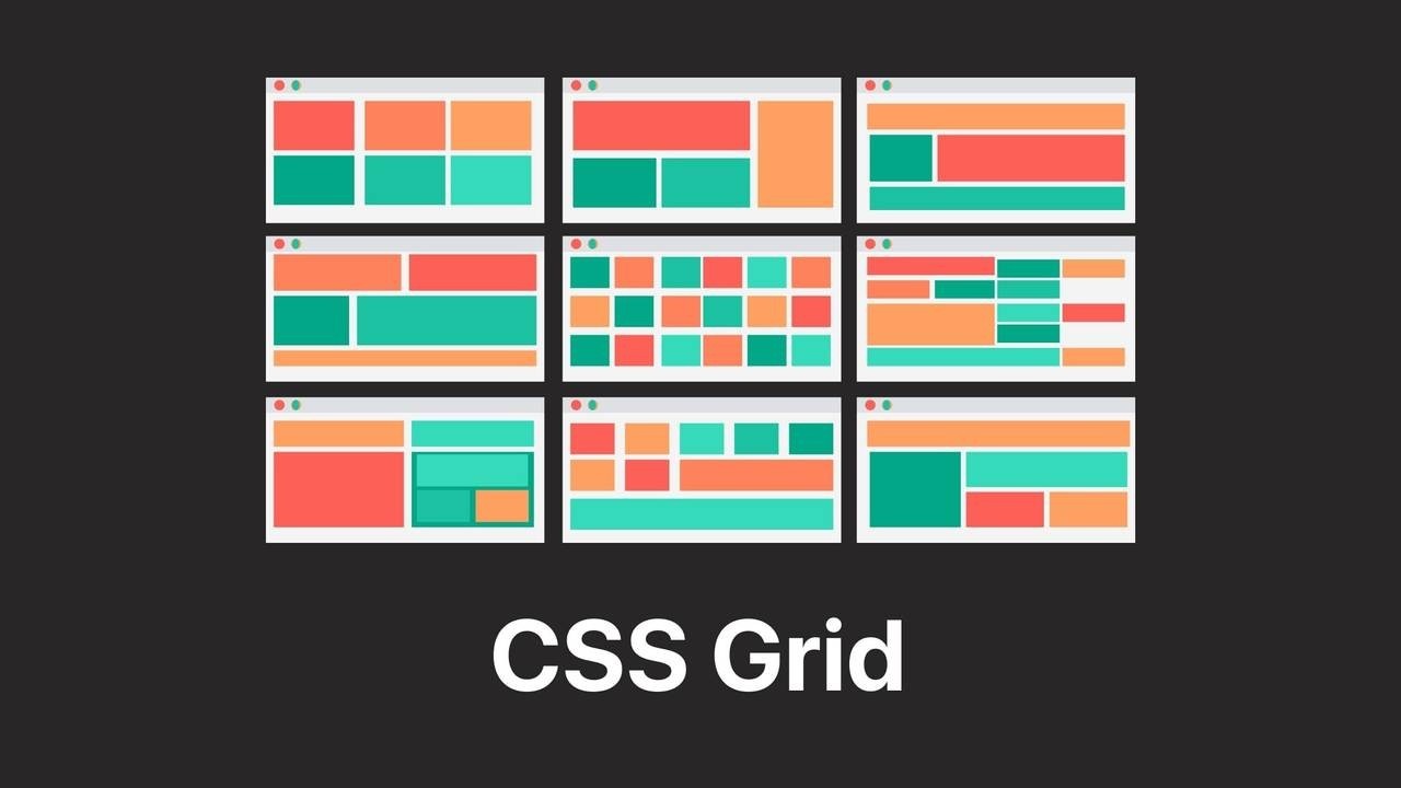
CSS grid
The CSS Grid Layout Module offers a grid-based layout system, with rows and columns, making it easier to design web pages without having to use floats and positioning. It helps to create a 2d layout.
to initialize the grid we need to write display: grid;.
so, now we have declared our container as a grid but to create rows and columns we need have to see the units fraction (fr).
fr unit is mostly used in the grid. 1fr means 1 fraction of 100%.
div{
    display:grid;
    grid-template-columns: 1fr 1fr;
    grid-template-rows: 1fr 1fr;
}
grid-template-columnsis used to define the no. of columns.grid-template-rowsis used to define the no. of rows.
div{
    display: grid;
    grid-row-gap: 1em;
    grid-column-gap: 1em;
}
grid-row-gapis used to give some space between grid-items in a row.grid-column-gapis used to give some space between grid-items in the column.
or we can use the shorthand property of grid-gap to specify the column and row spacing.
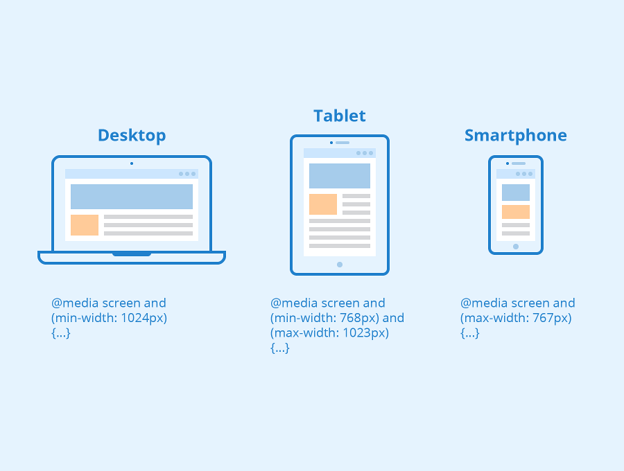
CSS media Queries
It is optional one can use media Queries and perform tasks or can use non-relative units to get the job done.
Media queries are used to make the website responsive so, that website will run in every resolution of the device like mobile, tablet, laptops, desktop, big screen.
@media screen and (min-width: 768px){
    body{
        background-color: red;
    }
}
It acts as a trigger, considering the above example if the screen comes to the width of 768px which normally is of tablets width then the body element will get overridden with new properties. This is how we can adjust the size of divisions in different resolutions. All this is known as responsiveness.
CSS Specificity
When more than one set of CSS rules apply to the same element, the browser will have to decide which specific set will be applied to the element. The rules the browser follows are collectively called Specificity.
Specificity rules include:
- CSS style applied by referencing external stylesheet has the lowest precedence and is overridden by Internal and inline CSS.
- Internal CSS is overridden by inline CSS.
- Inline CSS has the highest priority and overrides all other selectors.
Specificity Hierarchy: every element selector has a position in the Hierarchy.
- Inline style: Inline style has the highest priority.
- Identifiers(ID): ID has the second-highest priority.
- Classes, pseudo-classes and attributes: Classes, pseudo-classes and attributes come next.
- Elements and pseudo-elements: Elements and pseudo-elements have the lowest priority.
NOTE
- When two or more selectors have equal specificity, the last(latest) one counts.
- Universal selectors like body and inherited selectors have the least specificity.
CSS Structural Classes
Structural pseudo-classes allow access to the child elements present within the hierarchy of parent elements. We can select the first-child element, last-child element, alternate elements present within the hierarchy of parent elements.
The following is the list of structural classes.
- First-child
first-child represents the element that is prior to its siblings in a tree structure.
<style>
table tr:first-child{
 background-color:gray;
}
</style>
- nth-child[n]
nth-child(Expression) class applies CSS properties to those elements that appear at the position evaluated by the resultant of an expression. The expression evaluates to a value resulting in the position of the element in a tree structure.
For example, nth-child(2n+1) pseudo-class applies to the rows of tables that appear at the position of the given expression.
tr:nth-child(2n+1) represents rows such as 1st, 3rd, 5th, 7th.... for the n values of 0, 1, 2, 3.......
<style>
table tr:nth-child(2n+1){
 background-color:gray;
}
</style>
It means the background colour of the 1st, 3rd, 5th, etc, the element is grey.
- last-child
The last-child pseudo-class represents the element that is at the end of its siblings in a tree structure.
<style>
ul li:last-child{
 background-color:lightblue;
}
</style>
It means the background colour of the last child on the unordered list is light blue.
- only-child
only-child represents the element that is the sole child of the parent element and there is no other sibling.
<style>
div p:only-child{
 background-color:lightblue;
}
</style>
It means the first and last elements are the same.